
Choosing the right brand colors is pivotal when it comes to crafting a visual identity
Crafting a memorable visual identity for your brand begins with choosing the right color palette. The psychology of color has a powerful influence on consumer behavior and perception. Selecting effective brand colors can evoke emotions, convey messaging, and create a lasting impression. Whether you aim to exude trust, energy, or innovation, your brand colors play a pivotal role in shaping these perceptions. When choosing brand colors, it’s essential to consider not only personal preferences but also the impact these colors will have on your target audience.
From calming blues to vibrant yellows, each hue carries its own connotations and associations. In this article, we delve into the art and science of choosing brand colors that resonate with your audience, reflect your brand’s personality, and differentiate you in the market. By understanding the psychological and cultural implications of color, you can wield it as a powerful tool in shaping brand perception. Let’s explore how the effective selection of brand colors can elevate your visual identity and leave a lasting impression on your audience.
Identify Your Brand Personality
To begin, it’s essential to identify the unique personality traits that define your business and set you apart from competitors. Start by brainstorming a list of adjectives that describe your brand. Enlist the help of your colleagues to gain different perspectives and ensure a comprehensive analysis. Additionally, researching competitor brands within your niche can provide valuable insights into the qualities that make your brand distinctive. By analyzing and synthesizing these qualities, you can form a clear vision that resonates with your target audience.
Select a Core Brand Color Based on Personality Traits
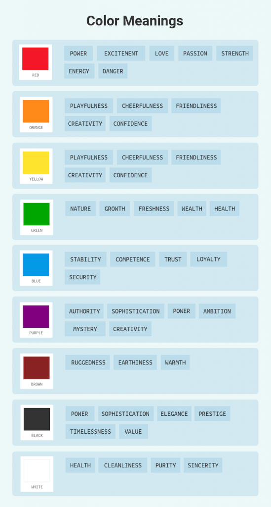
Color psychology offers valuable insights into the associations people generally have with different colors. Cool colors such as blue and green tend to evoke feelings of trust, loyalty, and stability, while warm colors like red and orange are more evocative of energy, excitement, and positivity. While these associations can vary depending on personal experiences and cultural backgrounds, they serve as a helpful starting point in selecting your core brand color.
Consider the following common color meanings:
- Blue: Trust, security, professionalism
- Green: Growth, health, harmony
- Red: Energy, passion, excitement
- Orange: Creativity, enthusiasm, warmth
- Yellow: Optimism, happiness, clarity
- Purple: Luxury, wisdom, creativity
- Pink: Playfulness, youthfulness, tenderness
Choose a color that aligns with your brand personality traits and effectively conveys the desired emotions and values. It should also differentiate your brand from competitors within your industry.
Build a Perfect Brand Color Scheme
Once you have chosen your core brand color, it’s time to build a cohesive color scheme that complements and enhances your brand identity. Consider the following strategies:
- Use a Core Brand Color: Select one dominant brand color that represents your brand and acts as a visual anchor. For example, Netflix and Spotify are known for their bold and vibrant brand colors.
- Create Color Variations: Use 2-3 variations of your core brand color to add depth and versatility to your palette. PayPal and MasterCard are examples of brands that employ different shades of their core color.
- Add a Contrasting Accent Color: Introduce a contrasting accent color that complements your core brand color and makes it stand out. This accent color can be used strategically to draw attention to specific elements of your branding.
- Balance with Vibrant Hues: Balance your core color and accent color by incorporating 3-4 equally vibrant hues. Brands like Google and Slack effectively use a combination of vibrant colors to create a visually engaging and harmonious brand identity.
Utilizing Your Brand Colors
Consistency is key when applying your brand colors across various marketing collateral. Here are some tips on effectively using your brand colors:
- Apply Colors Consistently: Ensure that your brand colors are used consistently across all marketing materials, including your website, social media profiles, advertisements, and packaging.
- Use Core Color as a Design Accent: Use your core brand color as an accent in your design. As a general guideline, allocate 10% of the design to your core color, 30% to your secondary brand color, and 60% to a neutral color. This composition allows your brand color to make an impact while maintaining a balanced visual appeal.
- Build Designs Around Your Core Color: Create designs that revolve around your core brand color to establish a strong brand presence and recognition. By incorporating your brand colors thoughtfully, you can enhance brand recall and consistency.
- Utilize Brand Kits: Leverage brand management tools and platforms that offer Brand Kits, allowing you to save your brand’s color palettes, logos, and fonts. This ensures quick access to your brand assets and maintains consistency across all your marketing efforts.
Your brand kit also comes in handy when you’re designing or outsourcing visual content, such as media kits.
How Pressfarm can help you create engaging content with your brand colors
Sometimes it can be challenging to know how to craft engaging content once you’ve settled on your brand colors. With the help of PR and marketing professionals, companies can create content that will resonate better with their target audience and be visible to the digital world.
PR agencies like Pressfarm work with companies to create eye-catching content to help them capture the eye of media professionals and potential customers alike. Creating a press kit is usually a good next step once you’ve established your brand colors because it helps you to successfully market your brand to the public and pitch it to media professionals. By giving these people an eye-catching branded press kit, you can ensure that your brand remains top of mind long afterwards.
Pressfarm is backed by a team of PR specialists, expert writers and certified designers who will ensure that your brand gets an aesthetically pleasing, impactful, and memorable press kit that you can use in multiple scenarios. Choose a package today and get started on developing a press kit that will make heads turn.
Establishing a Distinct Brand Identity
Developing a distinct brand identity is not only essential but also a fundamental step towards achieving success in today’s competitive business landscape. In an era where consumers are inundated with countless options, it has become imperative for businesses to carve out a unique niche and establish a strong brand presence. By investing considerable time and effort into understanding your brand personality, you can delve deep into the core essence of your business and unearth the qualities that make it truly special.
In conclusion, developing a distinct brand identity is a multifaceted process that requires careful consideration of various elements, including your brand’s personality and the selection of appropriate brand colors. By investing the necessary time and effort into understanding your brand’s essence and choosing colors that align with its values, you can create a visual identity that resonates with your target audience, distinguishes you from competitors, and effectively communicates your brand message. Remember, the colors you choose have a profound impact on how your brand is perceived, so choose wisely and apply them consistently to establish a strong and cohesive brand presence that leaves a lasting impression.