In our last post today on the Build Your Online Shop series, we look at the most important component of online advertising in terms of getting customers hooked and checking your store when they see your ads online on other websites.
Landing pages are very important to an online store that is kicking off its marketing strategy and willing to spend some dollars on that as well. You don’t want to spend money on a marketing strategy that doesn’t produce a good return on investment. While landing pages need to be functional and very easy to understand and navigate, their graphical appeal should never be underestimated.
You cannot forego the graphical appeal of your images for the functioning aspect of it. You need to balance and there is no way between these two aspects as you will notice from the examples we shall look at. These aspects have both to be on their A-level game, and to be on the very best, meaning the balance is actually somewhere around 100 percent for each of them.
Online store’s homepage vs. landing page
Most people think that an advert’s landing page should be the online store’s homepage. They have never been wrong before as they are now. The homepage is a page that consists of several products. The advert shown to the consumer was of a certain product on the store. It only makes sense therefore that the landing page leads you to the specific product the customer got interested in when they saw the ad.
For example, if you have an online store selling tech gadgets, this would be a very wide niche. You decide to focus on the keyword ‘Sony Xperia Phones’ for your advertising campaign. The advert should lead to the landing page that has ‘Sony Xperia Phones’ only to give the customer more curiosity to click through and check out all the phones. The ability of them ending up to buy is even higher. Woothemes did a great article on some of the free tools online to help you design great landing pages if you would like to check them out.
It’s possible for me to go ahead and rant about the most effective landing pages and the features they should have, but there has never been a better way of learning than seeing for yourself and getting the gist of it first-hand. So i’ll go ahead and list 2 landing pages that work differently or sometimes similarly but they are an end to a means of getting customers clicking through your online store and actually buying stuff. You see it, you believe it.
1. Whatisblik
This store has a call-to-action landing page, which is its homepage and rightly so. You enter your email address and get a coupon. It’s a nice way to grow your email list as an email list and if you are looking to run a campaign to grow your email list, something like this could really pay off.
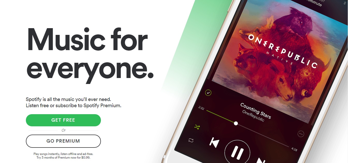
2. Spotify
Spotify is not an online store but it is an online business that highly depends on this landing page apart from the publicity they get. With a simple layout like this and a call to action the page is not too overwhelming, an entice enough page to get the people downloading the app which the business is based off.
This marks the end of the Build Your Online Shop series part one, in the next few months we shall beginning part two of it, if you missed the previous posts, check them out by clicking this link: Build Your Online Shop
Would you like help to make your landing page stream with leads? Pressfarm’s PR packages can help you do that through press release distribution, media kit design, and pitching journalists for a feature story. Reach out to us today!